Finding the perfect logo with math

Chrome, Anthropic, OpenAI: their logos existed decades before they did. I used math to find them.

A week ago I saw EmbeddingGemma 2 coming out from the Google labs and saw some cool demos with file search. A week prior I read Logo Modernism (2015), and I found out that many famous logos have actually taken inspiration (or just copied it tbh) from there.

Here are some examples I found:
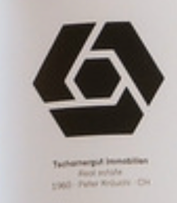
Technomarkt Immobilien logo (1960, Peter Hirzel): a black hexagon split into three interlocking segments around a hexagonal centre.Chrome
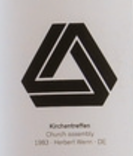
Kirchentreffen logo (1983, Herbert Wenn): an outlined triangle made of three interlocking bands.Google Drive
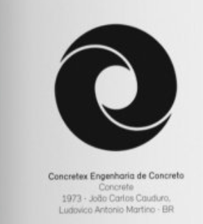
Concretex Engenharia de Concreto logo (1973, João Carlos Cauduro and Ludovico Antonio Martino): a black circle with a curling swirl cut out of it.Microsoft Edge
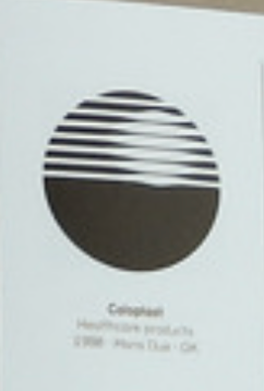
Coloplast logo (1958, Mans Due): a black circle whose upper half is cut into horizontal stripes.Linear
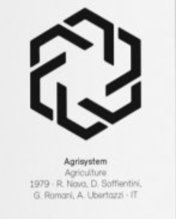
Agrisystem logo (1979, R. Nava, D. Soffientini, G. Romani, A. Ubertazzi): six interlocking black bands forming a hexagonal knot.OpenAI
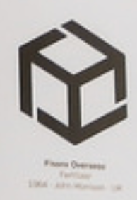
Fixons Overseas logo (1964, John Harrison): a cube outlined by three bracket-shaped black segments.Unity

and I also found Cursor, Lovable, Anthropic (just by me searching for an hour).

So I though that it could be a good idea to try to use the new technology with this "old" ideology.

So I made this demo (which you can find here too):

Also on X

Running Qwen Image 2.1 on a rented RTX 5090 in the cloud